PISTE Brand Evolution
Nzingha Prescod is an accomplished black Olympian fencer and NYC native. She created her non-profit in 2021 and recruited me as a graphic designer to help define her brand identity and create brand and marketing assets.
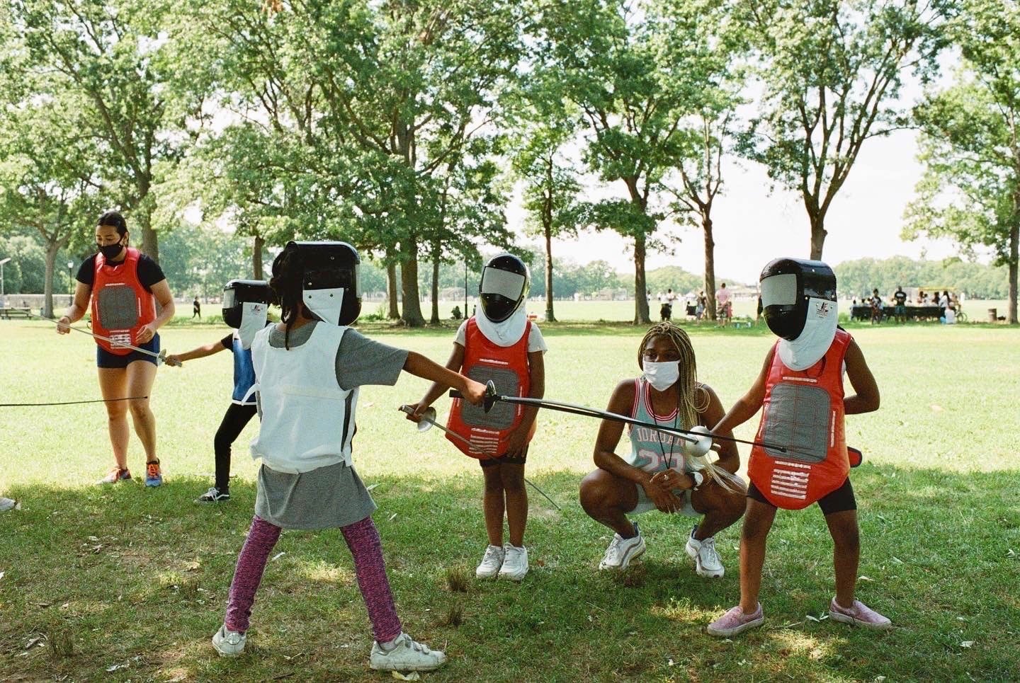
Her non-profit, PISTE, stands for the Prescod Institute of Sport, Teamwork and Education. PISTE provides fencing instruction, learning & educational opportunities, character building & leadership experiences to underserved youth of NYC at no-cost to families.
In my 3 year (and ongoing!) journey with this organization, I created its first brand identity, strategized around its fundraising goals, and rebuilt and evolved the brand to give it a refresh in 2024.
2021: Establishing a Name for a Fencing Academy
Nzingha first approached me in 2021 to help her come up with a name for her non-profit. At the time, the working name she had was NPEAK, which stood for Nzingha Prescod Expanding Access to Knowledge. We brainstormed a variety of names and acronyms until we landed with PISTE, which means the fencing strip in French.
The condensed font created clean lines that emphasized discipline in sport, while the silhouette of a fencer holding a blade made it clear that PISTE is a fencing organization. Inspired by African colors and patterns, we chose gold and green for the brand colors.
2024 Rebrand
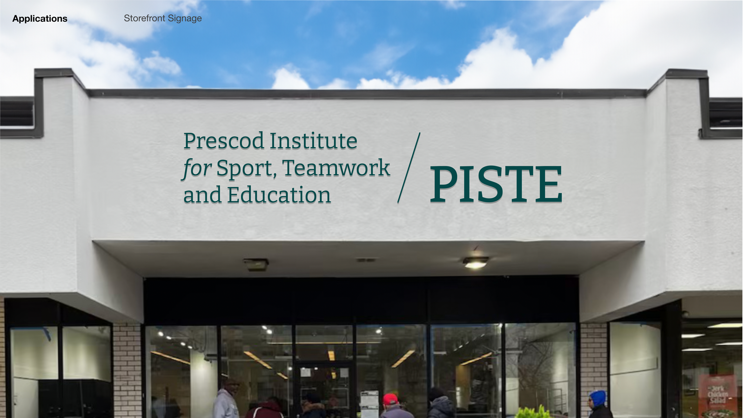
In January 2024 PISTE transitioned from its Flatbush YMCA rental to a permanent brick and mortar location, with a wide storefront and marquee. PISTE needs an identity that solidifies its presence in the local community, while attracting new students and families to the sport of fencing. PISTE’s wide range of programs and growing headcount also presents an opportunity to consolidate its activities under one umbrella.
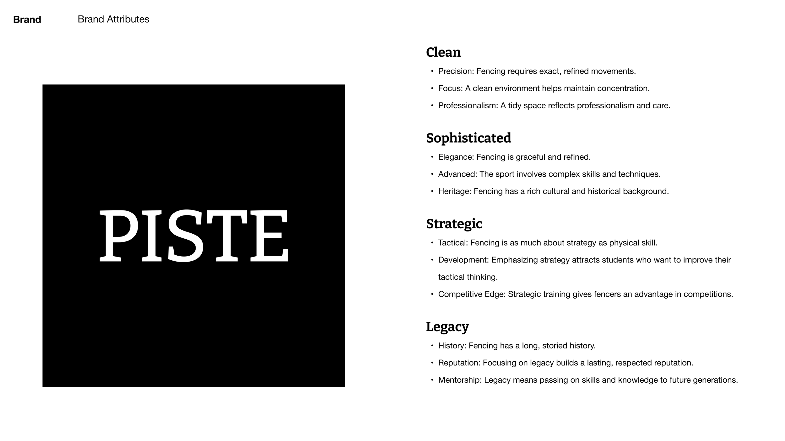
A Clean & Sophisticated Brand Direction
I presented Nzingha with 3 different style tiles to align on a visual direction and focused on keywords that she felt like really described her organization. Nzingha preferred the first option, which embodied the historical aspects of fencing.
Logo & Naming Strategy: A Brand that Cements Nzingha’s Legacy
Encompassing Many Programs
While originally called PISTE Academy, we recommended dropping the word Academy because that was the name of 1 of her many programs. We needed a logo template that could be customized to represent each program.
Highlight the Prescod Legacy
Students also didn’t know that PISTE stood for Prescod Institute. We needed a version of the logo that would spell out the full name and a visual that highlights her legacy to give her brand a historical feel.
Make it Obvious it’s Fencing
Many people in her community do not know of the sport of fencing. The word PISTE refers to the fencing strip but to the layman, the word doesn’t mean much. It was important to either include the word “fencing” or to show with visuals what fencing is.
Bright modern colors that build off the original brand green & yellow
For PISTE’s new color palette, we used bright and highly saturated colors to make the institutional brand more modern and youthful.
A typeface logo is a flexible canvas for guest artists who want to collab.
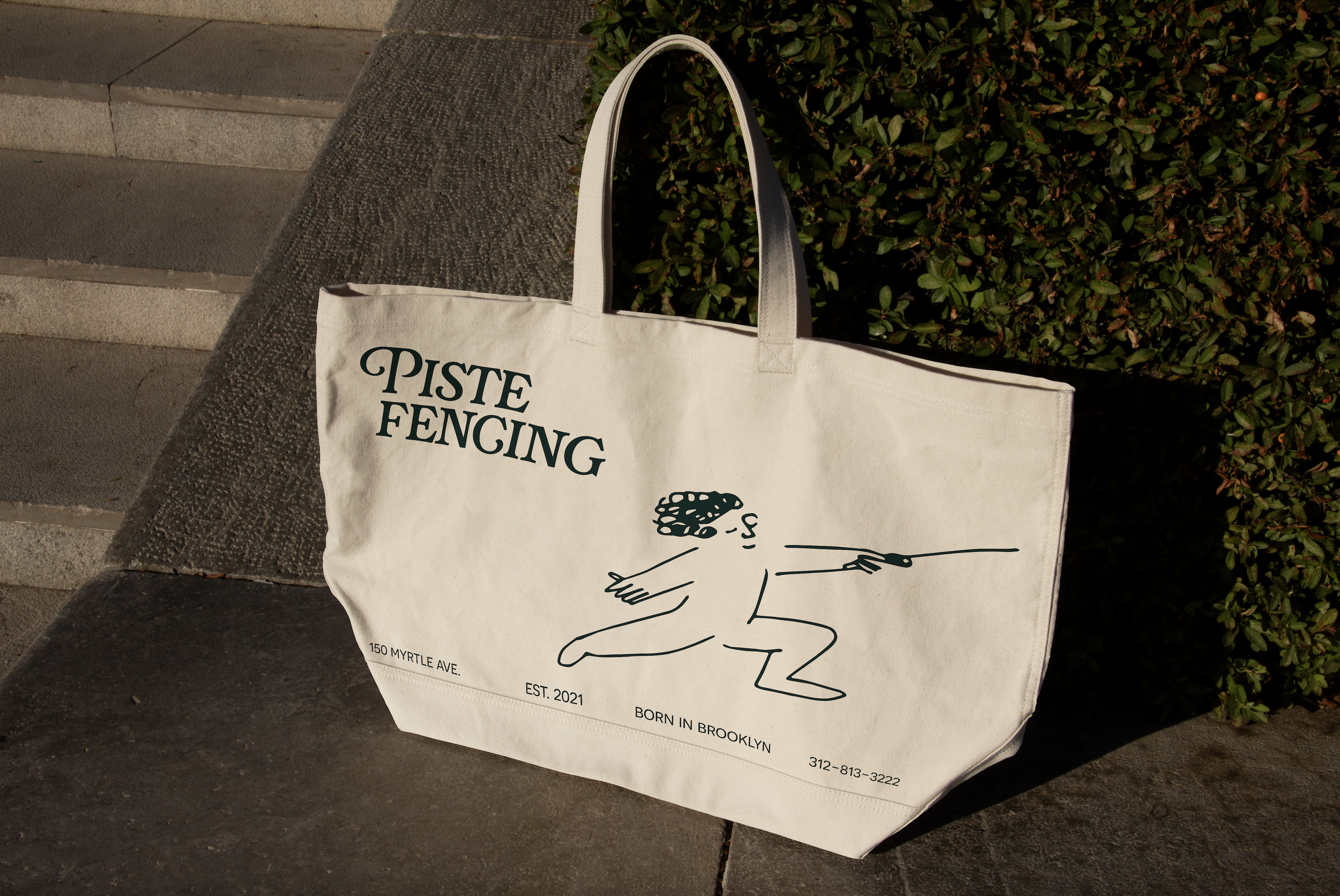
In the past, PISTE has had multiple volunteer artists such as Orfayo or Niki Chulo create limited edition merchandise. We wanted to showcase the flexibility that the PISTE brand can have with an alternate merch logo that is styled with more playful illustration and fonts that have more flourish.
A logo that scales for different mediums and purposes
Whether it’s storefront signage, the website, merchandise, social media or printed posters, the new PISTE identity has a logo version that can fit every occasion and purpose.
